
“ Whilst Julian lay on the couch, which was drawn up to the fireside, Waymark read aloud anything that could lead them to forget themselves. At other times, Julian either read to himself or wrote verse, which, however, he did not show to his friend. Before springtime came he found it difficult even to maintain a sitting attitude for long. His cough still racked him terribly. Waymark often lay awake in the night, listening to that fearful sound in the next room. At such times he tried to fancy himself in the dying man's position, and then the sweat of horror came upon his brow. ”
Quotes about “Waymark”
“ Waymark and freedom grew identical images; to be free meant to see him awaiting her and to put herself absolutely in his hands. Now that everything had turned out differently from what she had grown to anticipate with certainty, she found herself powerless to face the unexpected. Why had Waymark failed her?—she could do no more than repeat the question a thousand times, till the faculty of self-communing forsook her. It was as though the sun should fail one morning to rise upon the world, and men should stand hopeless of day for ever. ”
“ Osmond Waymark was light-hearted; and with him such a state meant something not at all to be understood by those with whom lightness of heart is a chronic affection. The man who dwells for long periods face to face with the bitter truths of life learns so to distrust a fleeting moment of joy, gives habitually so cold a reception to the tardy messenger of delight, that, when the bright guest outdares his churlishness and perforce tarries with him, there ensues a passionate revulsion unknown to hearts which open readily to every fluttering illusive bliss. ”
“ Litany Lane and Elm Court were names which already symbolised a purpose. If ever she still looked at her grandfather with a remnant of distrust, it was because she thought of him as drawing money from such a source, enjoying his life of ease in disregard of the responsibilities laid upon him. The day would come when she could find courage to speak to him. She waited and prepared herself. Prepared herself, for that, and for so much else. Waymark's behaviour would have cost her the bitterest misery, had she not been able to explain it to her own satisfaction. ”
R. W. Sindall, The Manufacture of Paper
“ Some of the watermarks are very elaborate and interesting. A familiar illustration of a beautiful design of this [Pg 68] description is to be found in the Bank of England notes. As a general rule the ordinary watermark consists of a mere trade term such as “Vellum,” “Zenobia,” or of the name of the manufacturer, such as “J. Whatman,” “R. Batchelor,” and so on. In the earlier days of paper-making many highly interesting designs were used, and some of these are still extant. In fact many of the names by which certain standard sizes of paper are known owe their origin to the watermarks employed. ”
George Henry Edward Hawkins, Poster advertising (1910)
“ As an example of the comparative pulling powers of illustrations I have understood that the news-stand sales of the Saturday Evening Post are appreciably larger when they have on their front cover the picture of an attractive woman than when the design is more general and of less heart interest. If you have a trade-mark for your product that trade-mark should always appear in your poster. ”
Cyril Davenport, The Book: Its History and Development
“ The pressure from the wire device thins the pulp wherever it is touched, and so when dry the device shows lighter than the rest of the paper.These marks should be called wire marks rather than watermarks, and the French word for them, “Filigranes,” is more correct than ours. The difference in tint between a watermark and the rest of the paper is so distinct that a photographic negative placed under one will render a capital photograph of it, far better than any drawing, but it needs a long exposure. ”
Nathan Clifford, Manufacturing Company v. Trainer…
“ Brands or stamps called trade-marks, says Waite, may consist of a name, figure, letter, form, or device adopted and used by a manufacturer or merchant in order to designate the goods that he manufactures or sells, and to distinguish them from those manufactured or sold by another, to the end that they may be known in the market as his, and thus enable him to secure such profits as result from a reputation for superior skill, industry, or enterprise. ”
W. Roberts, Printers' Marks: A Chapter in the History of Typography
“ In beauty of design and engraving, the Printer’s Mark, like the Title-page, attained its highest point of artistic excellence in the early part of the sixteenth century. This perhaps is not altogether surprising when it is remembered that during the first twenty years of that period we have title-pages from the hands of Dürer, Holbein, Wechtlin, Urse Graff, Schauffelein and Cranach. In his excellent work entitled “Last Words on the History of the Title-Page,” Mr. A. W. Pollard observes “From 1550 onwards we find beauty in nooks and corners. ”
W. Roberts, Printers' Marks: A Chapter in the History of Typography
“ Nearly every French printer and publisher of any note indulges in the luxury of a Mark of some sort, and an interesting volume might be written concerning modern continental examples. The practice of using a Printer’s Mark is an extremely commendable one, not merely as a relic of antiquity, but from an æsthetic point of view. Nearly every tradesman of importance in this country has some sort of trade mark ”
Arthur P. Greeley, Dissenting Report of Mr. Greeley With Reference to the Revision of the Trademark Law (1898)
“ It is generally considered that a mark to be effective for its purpose should be as simple and striking as possible, should either consist of or have as a prominent feature some representation or word which will be readily caught by the eye of the purchaser and retained in his memory, so that when he comes to make a second purchase he will look for and readily recognize that particular mark. ”
W. Roberts, Printers' Marks: A Chapter in the History of Typography
“ Shorn of all the romance and glamour which seem inevitably to surround every early phase of typographic art, a Printer’s Device may be described as nothing more or less than a trade mark. It is usually a sufficient proof that the book in which it occurs is the work of a particular craftsman. ”
 Tingfang Wu,
America, Through the Spectacles of an Oriental Diplomat
Tingfang Wu,
America, Through the Spectacles of an Oriental Diplomat
“ Every book and magazine contains many advertisements; sometimes fully half of a big magazine is covered with notices or pictures of articles for sale. Wherever you go the inevitable poster confronts you; and even when you look out of the window of the train you see large sign-boards announcing some article of trade. The newer the brand the bigger the picture. If when you get into a street-car you look around you will see nothing but advertisements of all kinds and sorts, and if you answer an advertisement you will keep on receiving notices of the matter about which you inquired. ”
Mrs. Lang, The book of romance (1902)
“ Here is the key, and in the name of the gods I will swear not to betray you.' The brothers took the key, and opened the chest that stood by Wayland, which was still half full of gold. It dazzled their eyes, and they both stooped down so as to see it better. This was what Wayland had waited for, and, seizing his sword, he cut off their heads, which fell into the chest. He then shut down the lid, and dug a grave for the bodies in the floor of his dungeon. Afterwards he dried the skulls in the sun, and made them into two drinking cups wrought with gold. ”
W. Roberts, Printers' Marks: A Chapter in the History of Typography
“ Any rule differentiating the Printer’s Mark proper from a 47 vignette is not likely to give general satisfaction; for a writer on the subject of vignettes will unfailingly appropriate many that are Marks, and vice versa. The present writer has found it a fairly safe rule, to accept as a Mark a pictorial embellishment (on a title-page) to which is appended a motto or quotation. ”
Edmund G. Gress, The Art & Practice of Typography
“ While the entire advertisement is easily read, especially in its larger form, and probably has the approval of those who insist on legibility in advertising composition, there is yet something about it that will also interest those who maintain that typography should be built on art principles. The border, trademark and name of the article advertised blend in tone, while the remaining type matter shows a pleasing gray. Inserting the trademark in the space left by the shorter words of the heading makes the effect unusual. ”
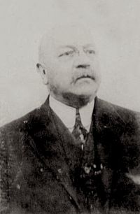 John N. Luff,
What Philately Teaches
John N. Luff,
What Philately Teaches
“ Watermarks are designs impressed in the paper pulp. The paper is slightly thinner in the lines of these designs and appears lighter when held to the light. Of course you are all familiar with this appearance from having noticed 50the watermarks in note paper. On rare occasions the watermark is a thickening of the paper instead of a thinning. In such a case the watermark appears more opaque than the paper. Watermarks in paper used for stamps are, of course, intended as a security against counterfeiting. ”
George Henry Edward Hawkins, Poster advertising (1910)
“ Give each salesman a list of the towns which you intend to post in his territory, and do it in advance in order that he may acquaint the dealer with the fact and use the publicity as a sales argument. The salesmen or members of your advertising crew, if you have one, should also be able to use the fact that you are going to post a town to secure window displays in advance from the local dealers, in order that their stores may be connected with the advertising and secure a certain portion of the demand. ”
W. Roberts, Printers' Marks: A Chapter in the History of Typography
“ In this printer’s Mark, and in fact nearly every other sixteenth century example, there is a very evident French influence, whilst many of the examples are the most transparent imitations of Marks used by foreign printers. Of the three used 66 by John Scott or Skot, who was printing books from about 1521 to 1537, two were mere copies of the Marks used by Denis Roce of Paris. We give an illustration of one example; the second is of the same design, but with a very rich stellated background, and the motto, “A l’aventure, tout vient a point qui peut attendre.” ”
R. Austin Freeman, The Red Thumb Mark — Chapter XIII (1924)
“ The slip of paper has been cut with scissors to fit the label, and it has then been pasted on to the surface that it has been made to fit, when all this waste of time and trouble—which, in practice, means money—could have been saved by printing the name on the label itself. ”
George Henry Edward Hawkins, Poster advertising (1910)
“ The repetition of the poster design in the store window at the place where the article can be purchased will be strongly supplemental, will tend to freshen the mind of the consumer as having seen the poster and create a desire to buy and try at just the right moment. ”
Harry Lawrence Gage, Applied Design for Printers
“ In the printed page, design is concerned with the arrangement of masses and lines on a flat surface—the face of the sheet of paper. Hence design in printing considers two dimensions only, width and length. The third dimension, depth, which must be treated in all but flat surfaces, can only be represented on the printed page and the means of showing depth is really an illusion by which the eye sees various colors and tones which convey a pictorial impression. ”
Edward Arthur Dawe, Paper and Its Uses (1914)
“ In machine-made papers it is the upper side of the paper as it is made, but in hand-mades the right side is the under side which receives the watermark. The watermark is in reverse upon the mould or the dandy roll, and is fixed on the impressionable pulp by slight compression or displacement of the fibres. In papers without water-marks it may be taken that the smoother side is the right side. The wrong side of machine-made papers bears the impress of the woven wire upon which they were made. ”
Edmund G. Gress, The Art & Practice of Typography
“ In order to test this, two labels of contrasting treatment are pictured mounted on a sheet of conventional wrapping paper.It will be admitted that the stronger label is more striking and catches the attention. There are those who will prefer the weaker label because of its neatness and beauty, yet we must not lose sight of the fact that labels, unlike business cards and letterheads, are not usually seen at close range when on packages. A business card is examined a few inches from the eyes, while a label on a package is frequently viewed from a point several feet away. ”
J. Walter Thompson Company, Things to Know About Trade-Marks…
“ In a business as far-reaching and as complex as that of Swift & Company, the quality of adaptability in a trade-mark is highly desirable. This trade-mark is of such a character that it may be used with appropriateness upon merchandise, stationery, packages, boxes, sides of cars, and in advertisements. ”
Edmund G. Gress, The Art & Practice of Typography
“ The style of lettering used for the firm name (Caslon italic) is a sort of trademark, as it is to be found on the store’s stationery, on its building and on its delivery cars. The ornamental border, especially the festoon effect at the head, 141is used in all the newspaper advertising. It will be noticed that two of the panels have been accentuated with stronger borders, larger headlines and with decorative illustrations. They are so placed in the general group as to balance pleasingly. ”
George Henry Edward Hawkins, Poster advertising (1910)
“ On a series of posters a whole story can be told, because one argument can be driven home on each poster. The “reason why” feature of advertising can be applied to posting by the use of this method, and in the development of posting in the coming years the tendency to limit the copy for a poster to merely the name and trade-mark will be over-ruled. ”
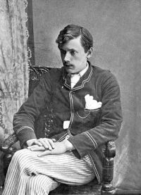 Ernest Christopher Dowson,
A Comedy of Masks: A Novel
Ernest Christopher Dowson,
A Comedy of Masks: A Novel
“ On the fashionable afternoon Lightmark's work was never without the little admiring crowd which denotes a picture of more than usual interest. The canvas, which had loomed so large in the new studio in Grove Road, was smaller than many of its neighbours, but its sombre strength of colour, relieved by the pale, silvery gold of its wide frame, and the white dresses of the ladies portrayed in the pictures on either side, made it at once noticeable. ”
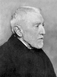 Henry Faulds,
Dactylography; Or, The Study of Finger-prints
Henry Faulds,
Dactylography; Or, The Study of Finger-prints
“ One may afterwards follow out each recognized lineation into further complexities or joinings, as you might trace out a railway line with its various junctions in a map.Diagrammatic Analysis of Lineations in a Restricted Section.A photographic enlargement, meant for forensic use, ought not to be marked or soiled in any way, but dots of coloured chalk or ink might be placed along the margins to denote where imaginary ruled lines might begin or end. One might also use glazed tissue paper, ruled in squares, or with eccentric circles like the mileage lines in a map of London. ”
W. Roberts, Printers' Marks: A Chapter in the History of Typography
“ The ninth Mark of this printer was a large and handsome one, being a royal and heraldic device which Wynkyn de Worde used as a frontispiece to the Acts of Parliament, in the form of an upright parallelogram which encloses a species of arched panel or doorway, formed of three lines, imitating clustered columns and Gothic mouldings, and two large square shields, that on the left charged with three fleurs-de-lys for France, and the other bearing France and England quarterly, each of which is surmounted by a crown. ”
J. Walter Thompson Company, Things to Know About Trade-Marks…
“ For the purpose of classification the Patent Office has issued a list of forty-nine general classes of merchandise. An applicant for the registration of a trade-mark must specify the class of merchandise with which his mark has been used, and must describe the particular goods in that class on which it has been used. In case his application is granted, his right to use the trade-mark is confined to the line of products named in his application. ”
Samuel Jesse Vaughn, Printing and bookbinding for schools (1912)
“ The numbered rectangles in Fig. 25 show the arrangement of pages in the work-and-turn method of imposing an eight page form. It will be observed that pages in the outside section of an eight page form are in the same order as those of a four page form. For a press that can accommodate only four pages, the inside and outside sections are imposed exactly in the same order as in Fig. 25, but are used as separate forms.When we undertake the imposition of an eight page job, we meet the problem of margin for trim, which has not been encountered in the previous forms. ”
